The art in maps
How to improve maps visualizations in R. [Originally posted at Medium Dec 14, 2018]
Since I started working on data analysis, what has fascinated me is how data visualizations can help to explain a huge amount of information in a simpler way than several tables or text pages in a simpler way. In this first post, I will share some code that could help to improve the esthetic and the presentation of graphs. I will use these posts as notes to myself and students. In that sense, it will always be a work in progress that could be improved. If you have any questions, please feel free to comment in this post. One of my main interests is spatial analysis, so I will use spatial data to construct some maps as an example. This post includes:
- Use spatial data in R
- Little steps to plot data into maps
- Tips to Improve visuals
- Combine multiple graphs
In this post, we will use several R packages that could be installed with the following command.
install.packages(c("maptools", "rgeos","tidyverse", "gpclib",
                   "mapproj","readxl","ggsci","viridis",
                   "ggridges","gridExtra"), type="source")
MAPS
We will construct a map of countries around the world with the vector data in the R library maptools. A vector data is a type of spatial data that contains geo-referenced geometries of an area of interest. A map with a higher resolution could be constructed (i.e sub-national level) using data from the GADM project. Here is a useful tutorial to deal with GADM data in R.
# Load vector data
library(maptools)
library(rgeos)
data(wrld_simpl)

# Remove Antarctica and Greenland
wrld_simpl <- wrld_simpl[wrld_simpl$ISO3 != "ATA",]
wrld_simpl <- wrld_simpl[wrld_simpl$ISO3 != "GRL",]

# Transform vector data into dataframe
library(tidyverse)
library(gpclib)
gpclibPermit()## [1] TRUEworld.df = fortify(wrld_simpl, region="ISO3")
# Construct a map
library(mapproj)
world.df %>%
ggplot(aes(x = long, y = lat, group = group)) +
geom_polygon(color = "black", size = 0.25) +
coord_map() +
theme_bw()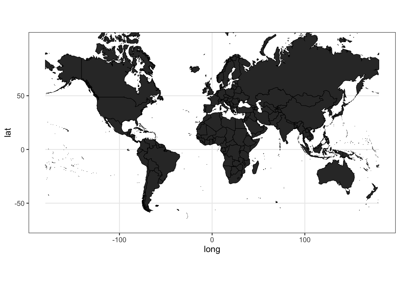
DATA
Now, we will bind additional information to observe what is the spatial distribution (across countries). We will use the data set from The 2018 SDG Index and Dashboards Report. You could find the data repository here. For this example, we will explore the distribution of Particulate Matter less than 2.5 micrometers (PM2.5)(µg/m3) in urban areas.
# Load data
library(readxl)
data <- read_excel("~/2019GlobalIndexResults.xlsx")

# Explore the dataset and select variables
var1 <- "PM2.5 in urban areas (µg/m3)"
var2 <- "Regions used for the SDG Index & Dashboard"
var3 <- "Healthy life expectancy at birth (years)"
var4 <- "Population in 2017"
vars <-c(var1, var2,var3,var4)
dat <- data %>% select(id,one_of(vars))

# Merge with spatial data
merge.world <- merge(world.df, dat, by="id", all=T)
final.plot<-merge.world[order(merge.world$order), ]

# Construct Map
final.plot %>%
  ggplot(aes(x = long, y = lat, group = group, fill= get(var1))) +
  geom_polygon(color = "black", size = 0.25) +
  labs(fill = var1) +
  coord_map() +
  theme_bw() +
  theme(legend.position="top")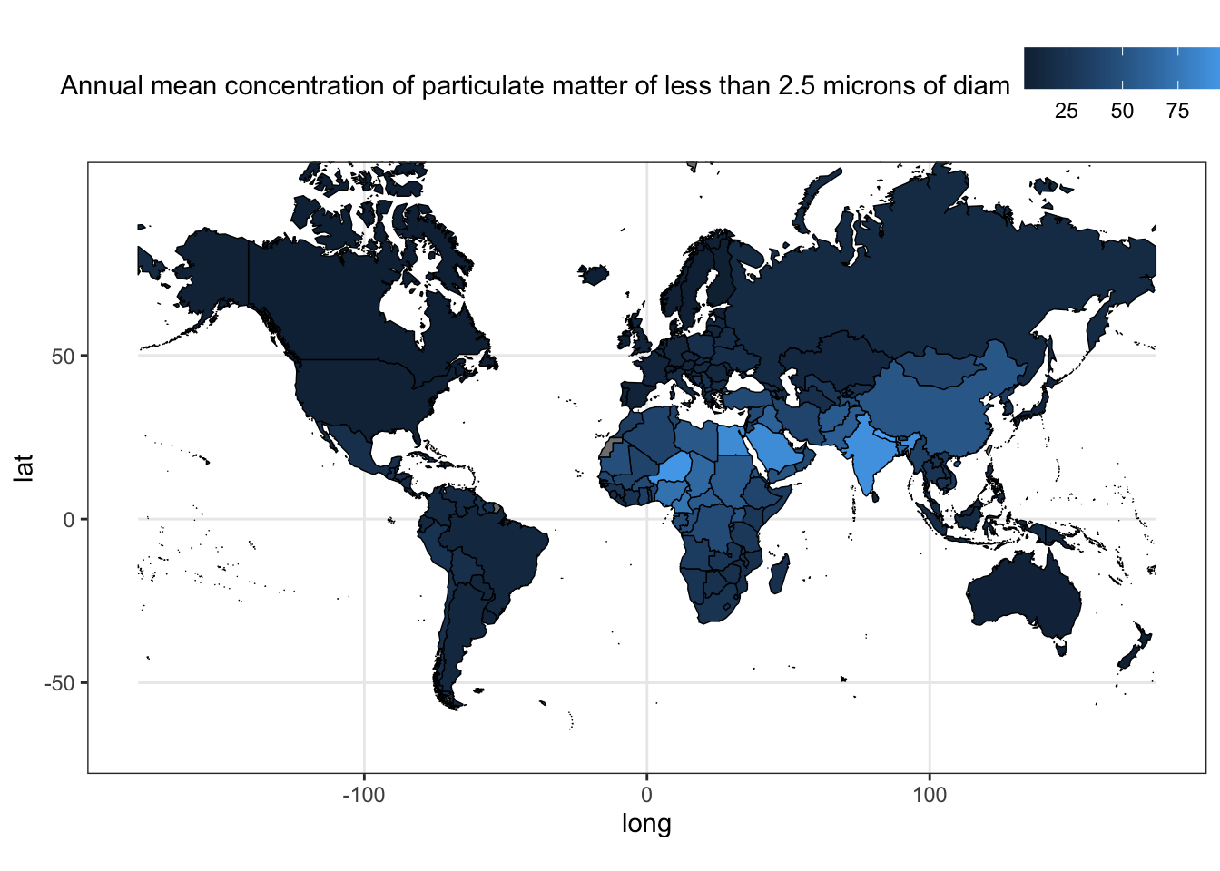
VISUAL TWEAKS
Our map could be improved to show the information in a better way. We will use the color palette 132892 from Color Hunt. If you feel lazy to choose the best color palette for your graphs, left it in the hands of Color Hunt. In addition, it shows the HEX codes to easily copy to R.
final.plot %>%
  ggplot(aes(x = long, y = lat, group = group, fill=get(var1))) +
  geom_polygon(color = "black", size = 0.25) +
  coord_map() +
  scale_fill_gradientn(colours =
                         c("#f3f0d1","#e29c68","#c85108","#a20e0e"))+
  labs(fill = var1) +
  theme_bw() +
  theme(legend.position="top")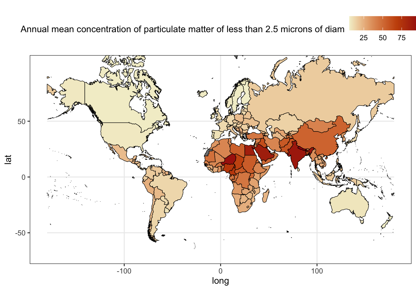
Or you could use the color palettes from the R packages: ggplot2, ggsci, colorspace, and viridis.
# ggsci
library(ggsci)
final.plot %>% mutate( cat = factor(ntile(get(var1),10))) %>%
  ggplot(aes(x = long, y = lat, group = group, fill=cat)) +
  geom_polygon(color = "black", size = 0.25) +
  coord_map() +
  scale_fill_npg() +
  labs(fill = paste0("Deciles\n",var1)) +
  theme_bw() +
  theme(legend.position="top")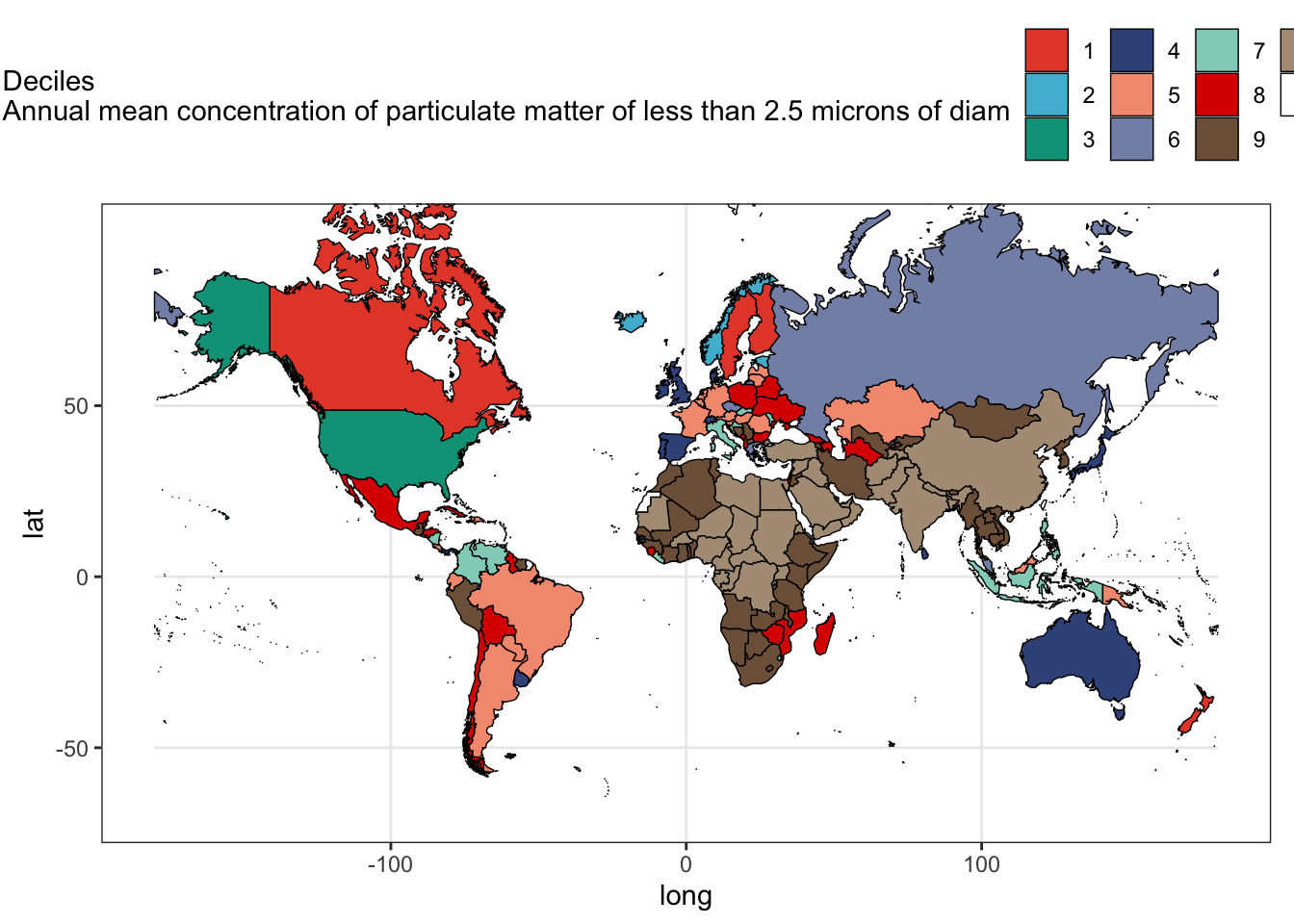
# colorspace
library(colorspace)
final.plot %>% mutate( cat = factor(ntile(get(var1),10))) %>%
  ggplot(aes(x = long, y = lat, group = group, fill=cat)) +
  geom_polygon(color = "black", size = 0.25) +
  coord_map() +
  scale_fill_discrete_sequential(palette = "BurgYl") +
  labs(fill = paste0("Deciles\n",var1)) +
  theme_bw() +
  theme(legend.position="top")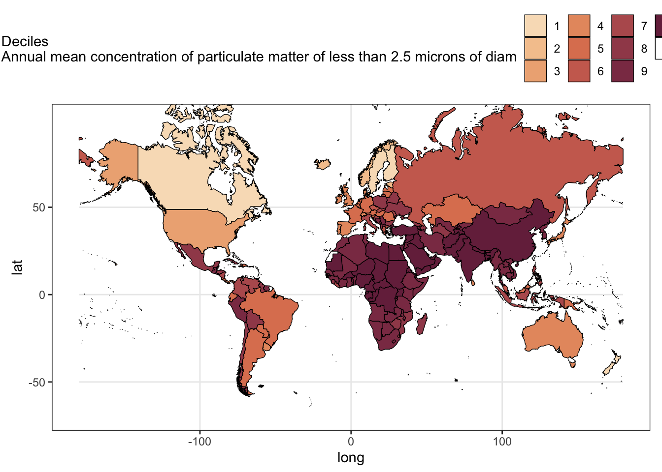
# viridis
library(viridis)
final.plot %>%
  ggplot(aes(x=long, y=lat, group=group, fill=log(get(var1)))) +
  geom_polygon(color = "black", size = 0.25) +
  coord_map() +
  scale_fill_viridis(direction = 1) +
  labs(fill = var1) +
  theme_bw() +
  theme(legend.position="top")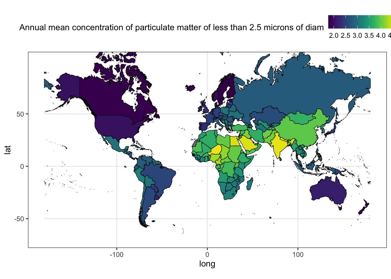
COMBINE GRAPHS
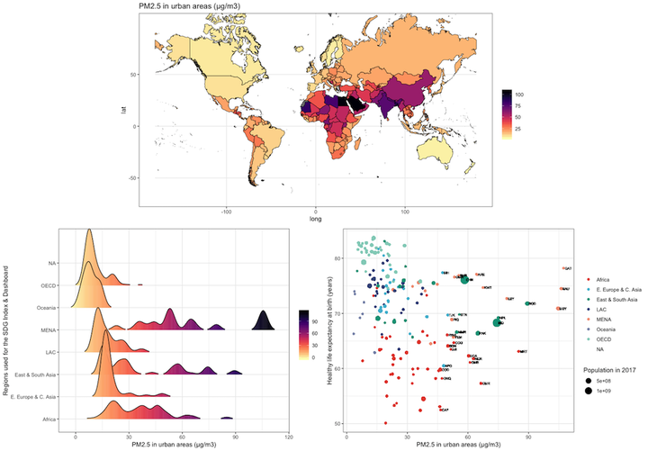
Finally, we will combine our maps with other plots about the distribution of PM2.5 by United Nations (UN) sub-region using grid.arrange.
# Spatial Distribution
p1<-final.plot %>%
  ggplot(aes(x = long, y = lat, group = group, fill=get(var1))) +
  geom_polygon(color = "black", size = 0.25) +
  coord_map() +
  scale_fill_viridis(option="magma", direction = -1) +
  labs(title = var1, fill = "") +
  theme_bw()

# Distribution by UN areas
library(ggridges)
p2<-final.plot %>%
  ggplot(aes(x = get(var1),
             y = get(var2),
             fill = ..x..)) +
  geom_density_ridges_gradient(scale = 3, rel_min_height = 0.01) +
  scale_fill_viridis(option="magma", direction = -1) +
  labs(fill = "", x=var1, y=var2) +
  theme_bw()

# Scatterplot of PM2.5, life expectancy and Population
p3<-final.plot %>%
  ggplot(aes(x = get(var1), y = get(var3))) +
  geom_point(aes(col=get(var2), size=get(var4))) +
  geom_text(
    aes(label=ifelse(get(var1)>quantile(get(var1),.9, na.rm=T)
                             ,id,NA)),hjust = -.2,
            size=2) +
  scale_color_npg() +
  labs(col = "", x=var1, y=var3, size=var4) +
  theme_bw()

# Combine Graphs
library(gridExtra)
(fig<-grid.arrange(p1,arrangeGrob(p2, p3, ncol=2), nrow = 2))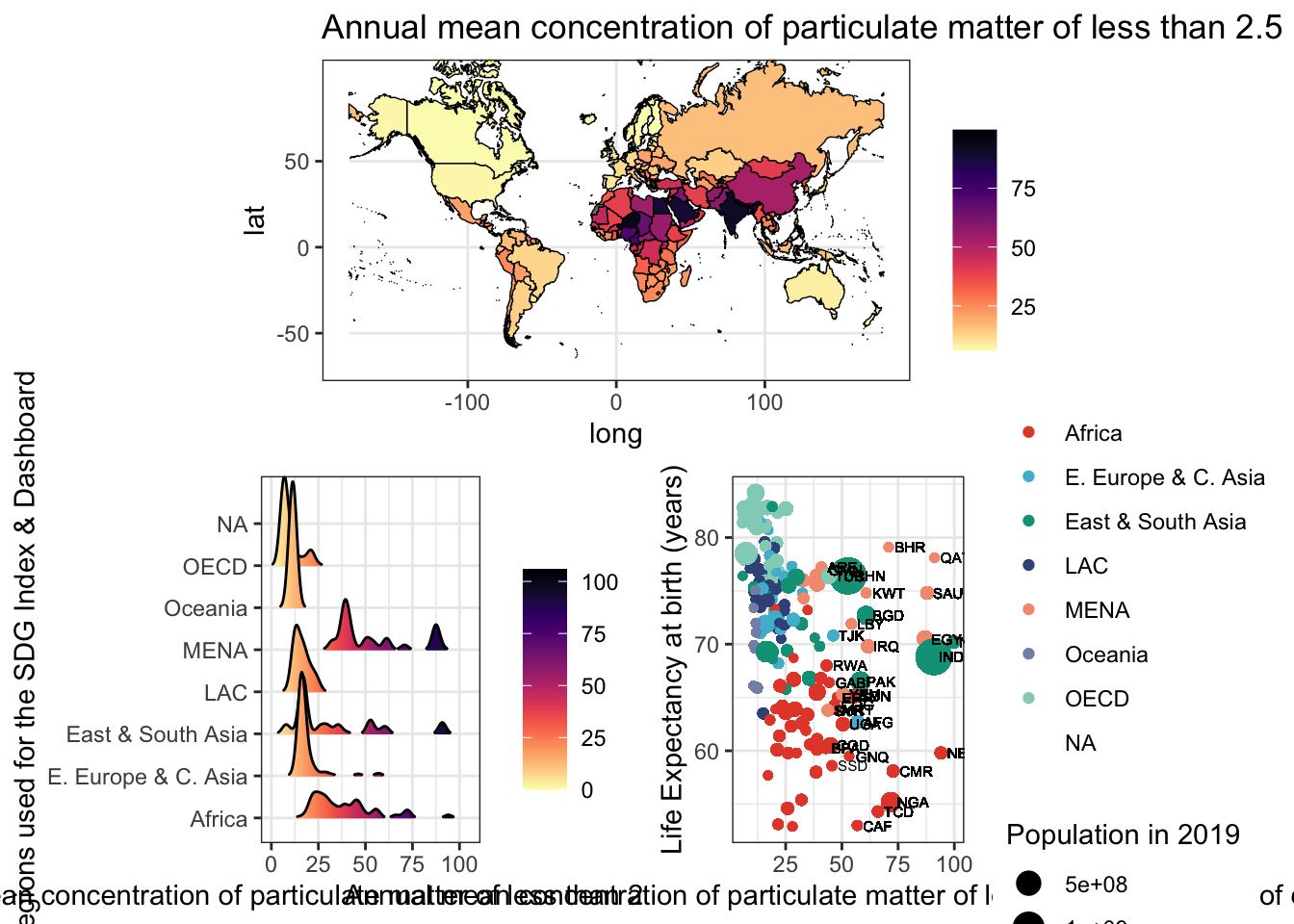
## TableGrob (2 x 1) "arrange": 2 grobs
##   z     cells    name            grob
## 1 1 (1-1,1-1) arrange  gtable[layout]
## 2 2 (2-2,1-1) arrange gtable[arrange]Gabriel Carrasco-Escobar
Assistant Professor
My research interests include infectious diseases epidemiology, causal inference, global health, Climate Change, Data Science, Urban Health, and Geospatial modeling & viz.